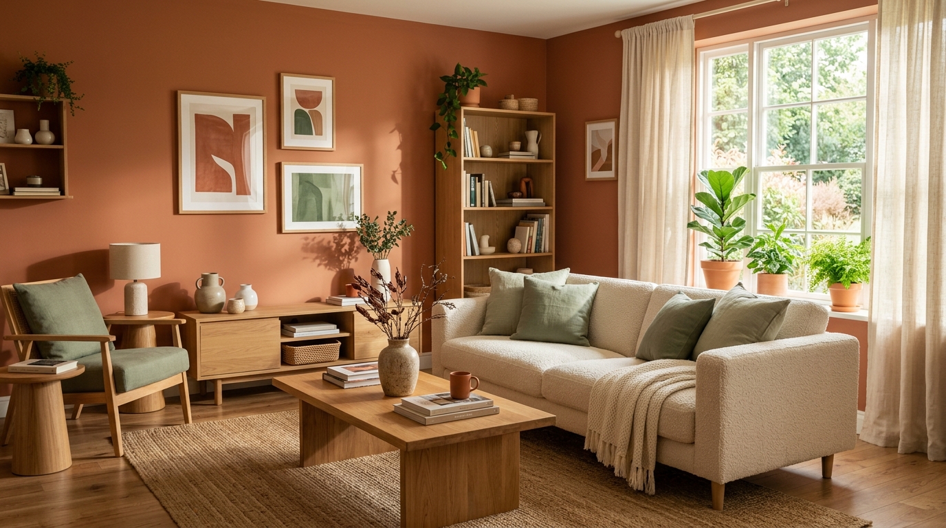
Living room color is shifting again for 2026, and the direction is fairly consistent across the design commentary showing up this year: the cool, flat grays that defined the last decade are giving way to warmer, more textured, more saturated choices. None of this requires ripping out what you already own — most of these directions can be tested in your existing room before you commit to a can of paint.
The directions gaining ground
Warm, earthy neutrals. Clay, terracotta, warm taupe, and soft browns are showing up as base wall colors in place of cooler grays and stark whites. The effect reads warmer and less clinical, especially in rooms with a lot of natural wood or textile already in them.
Deeper anchor colors instead of pure accents. Rather than a neutral room with one bold accent wall, more living rooms are leaning into a single deeper color — a forest green, a deep olive, a rich chocolate brown — as the dominant tone of the space, often on more than one wall.
Plaster and lime-wash style finishes. Beyond the color itself, texture is part of the trend: chalky, slightly uneven plaster-style paint finishes are replacing flat matte, giving walls more depth without changing the color palette.
Warm wood paired with muted color, not white. Wood furniture and flooring are increasingly paired with muted blues, greens, or warm neutrals on the walls rather than white or gray, for a softer overall contrast.
“Quiet luxury” tones. A broader move toward muted, cohesive palettes — everything in a room reading as part of one warm, low-contrast family — rather than high-contrast pairings.
Why trend photos rarely translate directly to your room
Every one of these directions looks great in the styled photos accompanying trend roundups — professionally lit, staged rooms with furniture chosen specifically to complement the wall color. Your actual living room has different light, a different layout, and furniture you already own and aren’t necessarily replacing. A color that reads as warm and cozy in a south-facing showroom can look muddy in a room with less natural light, and a deep anchor color that works with all-new furniture might clash with what you already have.
That gap is exactly why “how would this look in my room” is a better question than “is this color trending” — and it’s answerable without committing to anything.
Try it in your own room first, reversibly
The lowest-risk way to test any of these directions is in order of commitment:
- Small accessories first — a pillow, throw, or rug in the new tone, easy to return if it doesn’t work.
- A digital preview of the full room — seeing the actual wall color and finish applied to a photo of your real space, including your real furniture and lighting, before buying paint or hiring anyone.
- A test patch — once a digital preview confirms the direction works, a small painted swatch on the actual wall is the last check before committing.
See it in your own room for free
Upload a photo of your room, pick a style, and compare a redesign made with instructions to keep your room layout. No signup needed.
Redesign my room freeSee how Roomcast redesigns your actual roomOr get Roomcast on iPhone1 free watermarked preview a month. Premium on iPhone: $4.99/week with a 3-day free trial, $6.99/month, or $29.99/year with a 3-day free trial.
Step two is where most people skip straight to guessing, because there hasn’t historically been an easy way to see a color trend applied to your specific room rather than a generic one. It’s also the same underlying idea covered in more depth in our guide on redesign apps built for renters — applying a new look to a space without changing anything you can’t undo.
Where Roomcast fits
Roomcast’s free web demo at getroomcast.com/try lets you upload a photo of your actual living room and preview these color and style directions on it directly — no account required. Because it keeps your real windows, walls, flooring, and furniture intact, the preview reflects what the color would genuinely look like in your space, not a staged room that happens to use the same palette. If you want to keep experimenting past the free demo, the paid tier is $6.99/month or $29.99/year, and there’s a native iOS app as well.
Bottom line
2026’s living room color trends are moving warmer, deeper, and more textured — but the trend photo is never your room. Test any direction against your actual space, starting with the lowest-commitment option, before you buy paint.
See it in your own room for free
Upload a photo of your room, pick a style, and compare a redesign made with instructions to keep your room layout. No signup needed.
Redesign my room freeSee how Roomcast redesigns your actual roomOr get Roomcast on iPhone1 free watermarked preview a month. Premium on iPhone: $4.99/week with a 3-day free trial, $6.99/month, or $29.99/year with a 3-day free trial.
Keep exploring: room ideas, all Roomcast alternatives compared, or redesign your own room free.